

Source: Fidelity.com
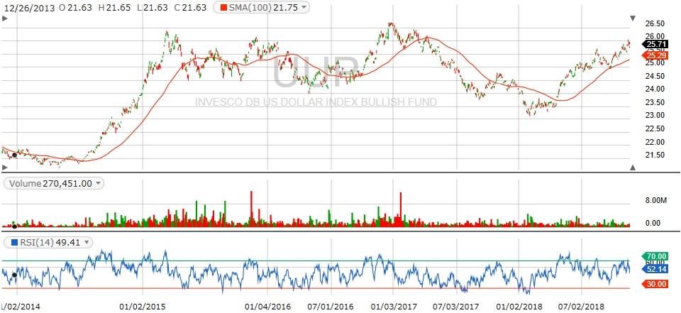
Well, your Gold Enthusiast looked at the one-year chart and it didn’t say much more. Also, the two-year chart isn’t quite telling enough of a story either. So, unfortunately, we’re into a five-year chart. In general, your Gold Enthusiast doesn’t like five-year charts for two basic reasons: One, the candles get so small they’re hard to see with aging eyes; and two, who the heck thinks conditions are similar enough over five years so, the chart actually says anything valid?
In response, we’ll have to concede that we are still in the longest bull run in US stock market history. So conditions really have been similar until now over the past five years. What we’re looking for is the end of this period, so it does make sense that we look at a five-year chart, because when things change the chart will show it.
Unfortunately, even this chart doesn’t spell out an impending doom or massive opportunity. The USD isn’t at an overall peak even for two years. In fact, it’s bouncing off the secondary peak below the highest peak. So, the farthest out on a limb you can go with basic technicals is that it’s too early to tell if this is “the last” peak, or if this is just another wave in the trend.
Things we’ll be watching: The Euro, since it makes up over 50% of the US Dollar index — The EU and Italy are locked in battle right now (darn deficit spending!); any move by China toward a hard currency, i.e. backing yuan/RMB with gold; any sudden run-up in interest rates. Those are probably the most significant canaries in this coal mine.
Signed, The Gold Enthusiast
DISCLAIMER: No specific security was mentioned in this article. The author is long the gold mining sector through a small portfolio of ETFs and specific mining stocks.
About the Author:

More Resources for the Stocks in this Article
| Ticker | POWR Rating | Industry Rank | Rank in Industry |
| Get Rating | Get Rating | Get Rating |
9 "Must Own" Growth Stocks For 2019
Get Free Updates
Join thousands of investors who get the latest news, insights and top rated picks from StockNews.com!
Top Stories on StockNews.com

Best & Worst Performing Mega Cap Stocks for July 11, 2025
AEXAY leads the way today as the best performing mega cap stock, closing up 34.37%.
Best & Worst Performing Mega Cap Stocks for July 10, 2025
AEXAY leads the way today as the best performing mega cap stock, closing up 13.49%.
Best & Worst Performing Mega Cap Stocks for July 9, 2025
AEXAY leads the way today as the best performing mega cap stock, closing up 13.49%.
Best & Worst Performing Mega Cap Stocks for July 8, 2025
AEXAY leads the way today as the best performing mega cap stock, closing up 13.49%.